The Hand-Painted Signs Giving New York Restaurants Their Character
Will Van Zee’s signs make a case for the value of human work in a city full of restaurants competing for attention. His Brooklyn studio, Van Zee Sign Co., paints and gilds storefront signs for places including Elbow Bread, S&P Lunch, and Levain Bakery. The craft is old; the route to finding him is decidedly current. Videos of his brushwork and gold-leaf technique draw millions of views on Instagram.
That pairing is more significant than it looks. A painstakingly painted sign gives a restaurant a physical identity, while its making can travel widely as video. If you’re deciding where to eat, that visible investment in craft can also suggest how much care went into the rest of the business. It’s a useful signal, though a sign alone can’t tell you what’s happening in the kitchen.
Van Zee’s work has caught the eye of Person of Interest, a series about people and projects drawing attention now. We spoke with the Brooklyn-based painter about his path into the trade, the role Instagram has played in renewed interest in sign painting, and why he thinks handmade design still carries weight amid AI-generated imagery and cheap digital graphics.

His argument is straightforward: a hand-painted sign has the irregularity of work made by a person, much like a meal cooked by a chef. For clients, paying more and waiting longer can signal that they value craftsmanship. That message may matter especially in fine dining, where customers read care into the details.
Van Zee came to the work by way of product design and restaurants. He moved to New York in 2008 to study product design and began painting signs professionally about a year after graduating. His brush control started earlier, painting fences, trim, and siding as a kid; his connection to restaurants began at 16, washing dishes and working his way into the kitchen. Now, after roughly 13 or 14 years in the sign business, he says familiar chefs, owners, contractors, and designers often bring him into new projects through word of mouth.
His approach also looks backward. He studies archival photographs to understand the visual character of New York neighborhoods, then works with clients to adapt older lettering and sign designs for a new business. The aim, he says, is to preserve something of the city’s visual language while making each sign fit the place it represents.
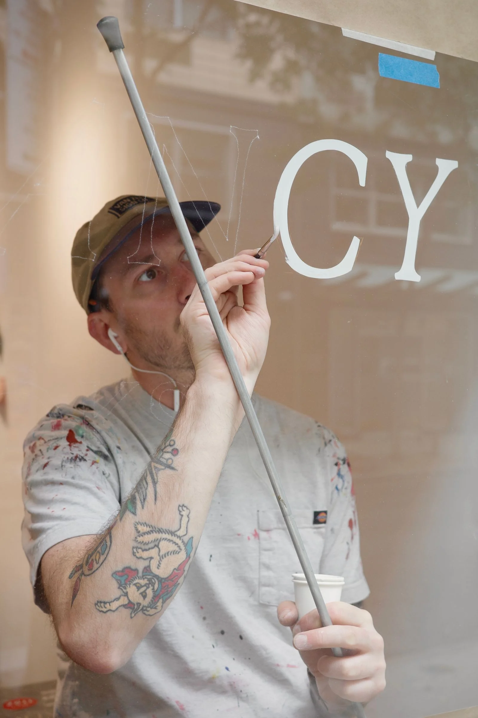
For Van Zee, the reward is seeing a restaurant emerge from construction and celebrating its opening with the people who built it. He often first encounters a project before it’s finished; friends-and-family night gives him a chance to see the completed space, taste the food, and watch the team’s work come together.
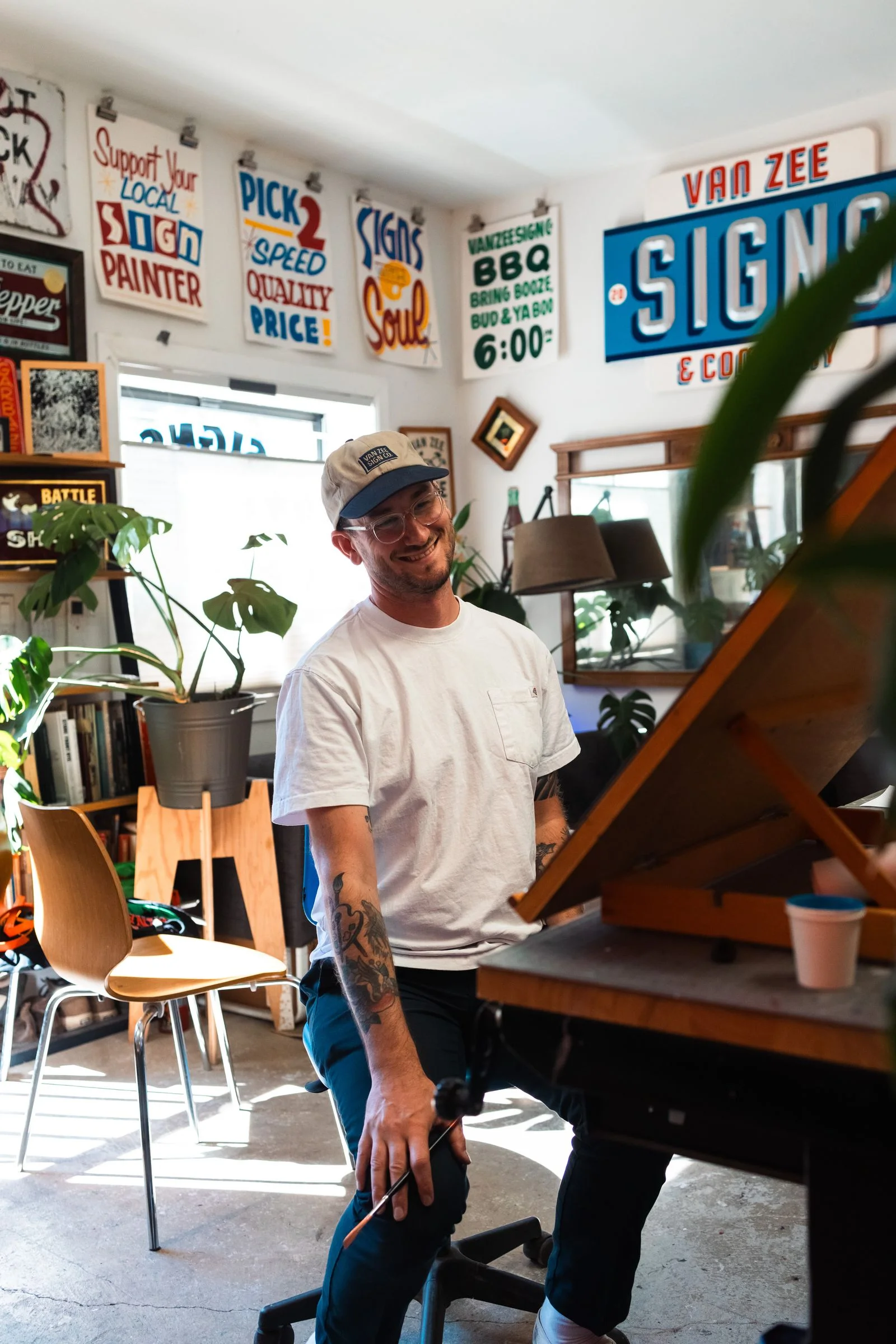
That handmade philosophy sits in sharp contrast with the synthetic food imagery now circulating online. Restaurants are using unsettling AI-generated photos of food, but Van Zee’s work depends on the marks of a real brush and the careful placement of delicate gold leaf. It’s a tangible way for a restaurant to show what it values. Whether customers always read the sign that way is harder to know; the craft itself, at least, makes the claim visible.
This interview is part of Person of Interest, a series speaking with people about their projects, past and present.
By Emma Jacobson · October 29, 2026
Social media changed how this sign painter works—and how people see the craft. He was initially reluctant to join in, without even a personal Instagram account, until his wife urged him to document and share his projects. Now, he says, that habit has made him a better documentarian. Signs may not occupy much of our attention, but they shape how we experience businesses and city streets. Sharing the work has helped people notice that, while also bringing in business.
Restaurant work that lasts
Among the restaurant projects he singles out are Rezdôra, Sailor, Levain Bakery, S&P Lunch, and Baby Blues Luncheonette, where he designed the logo. Sailor carries a personal connection: it’s in his neighborhood, and he’d often eaten at the restaurant that occupied the space before it.
His clearest measure of a successful project is time. New York restaurants often close, so seeing one flourish a decade on means something. Rezdôra stands out for that reason. Its signage is relatively restrained, but the restaurant has become beloved; he’s proud to have played a small part in building an identity that lasted. That may be the quiet achievement of sign painting: the work can become part of a place people love, even when they don’t stop to think about the sign itself.